Danny Driscoll · Principal Product Designer
Designing products where mistakes have consequences
18+ years. TeleSign · Netflix · Appily.com

Selected Work
Four case studies.
Logitech G · Kamp Grizzly
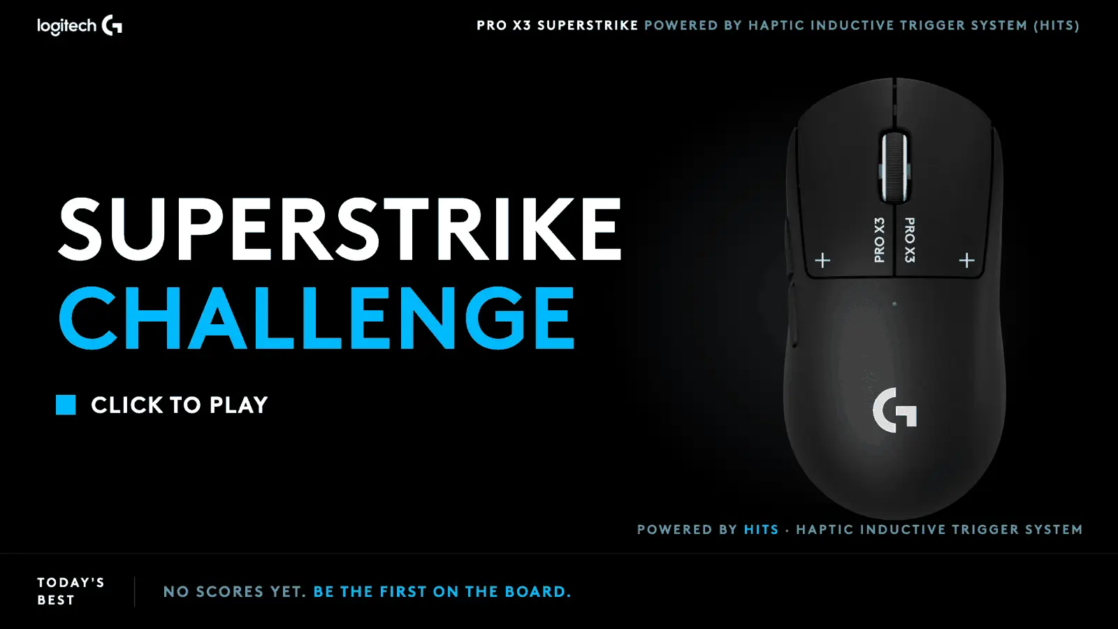
Logitech G Superstrike Challenge
Shipped in 5 working days
Designed and shipped a gamified click speed kiosk for the Logitech G PRO X3 SUPERSTRIKE, commissioned by Kamp Grizzly. Five working days inside a fifteen day window, one self-contained HTML file, live on the show floor.
TeleSign
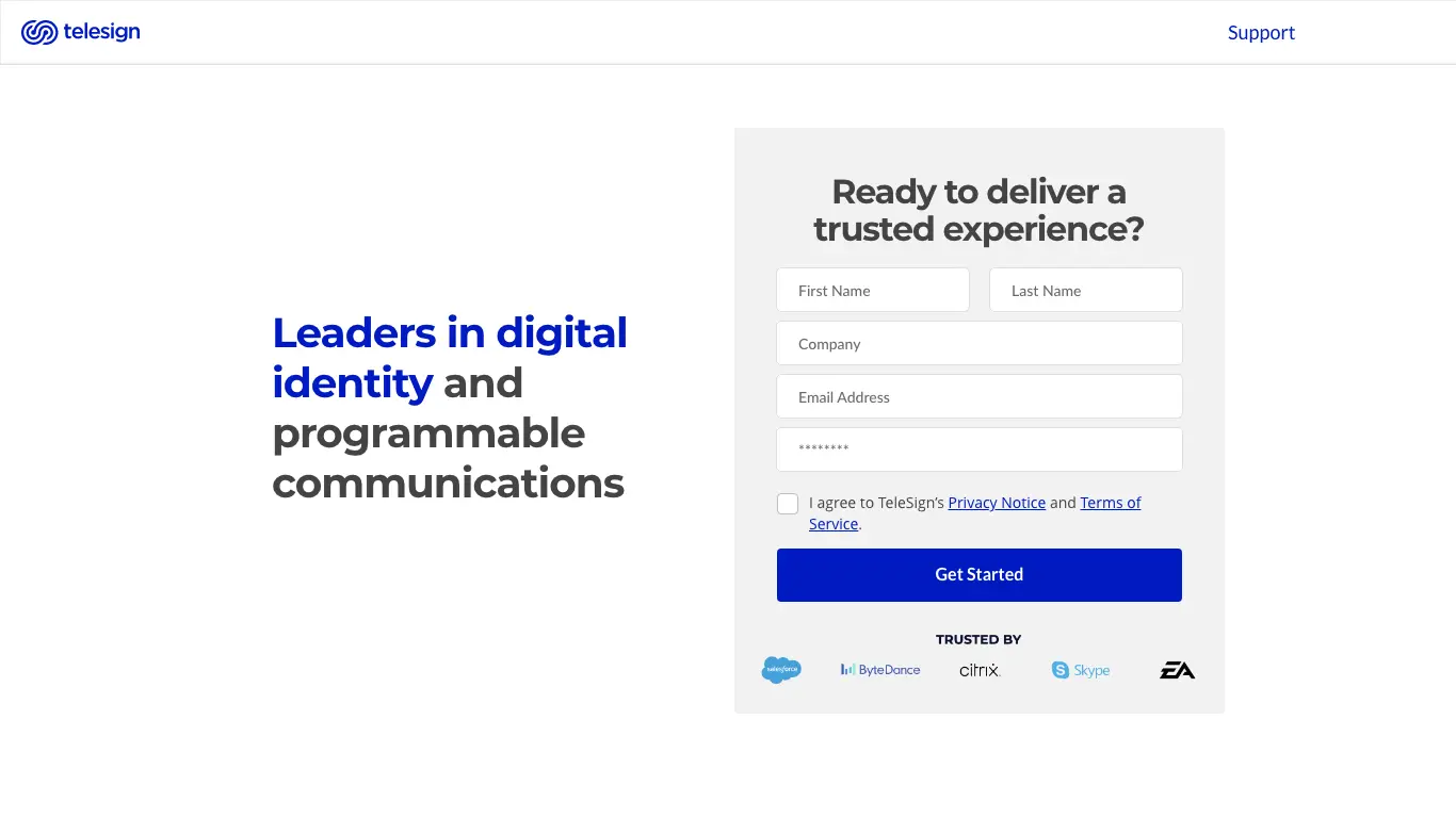
TeleSign Self-Service Customer Portal
48% faster onboarding
Designed a self-service portal. Simpler products went live same-day. Regulated configurations dropped from 67 days to 35. 85% of customers onboarded without CS, and TeleSign opened to the SMB market.
TeleSign
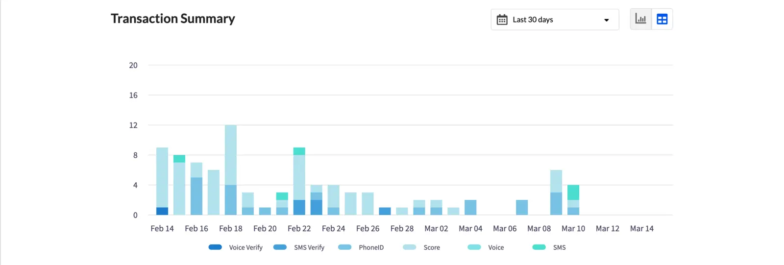
TeleSign Fraud Prevention Suite
21B+ transactions protected
Designed the UI for an ML-powered fraud prevention suite protecting 21B+ annual transactions, giving non-technical fraud analysts intuitive control over 1,000+ configurable risk parameters.
Appily.com
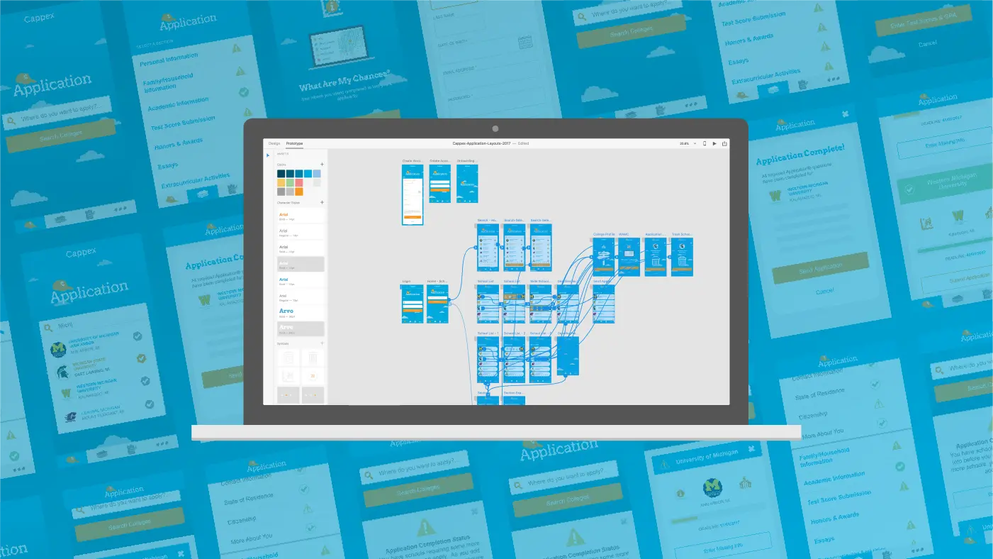
Universal College Application
47% completion rate
Designed the world's only user-friendly multi-college application platform at Appily.com (formerly Cappex), achieving 47% completion against a 20–35% industry standard and scaling from 250K to 1.5M users.
“Design like someone’s safety depends on it. Sometimes it does.”
Origin
Why design?
Fall of sophomore year. Waldo Library, Western Michigan University. Third floor computer lab, about 75 machines, a wall of windows on the far side. I was in line at the front desk, trading my numbered mouse pad back for my student ID.
Behind me, someone yawned. Loud, both hands to the face, the kind you’d fake in an improv skit. I looked, thought nothing of it, and turned back to the desk.
Then the gasps. The same student was bouncing in their chair.
I lifeguarded every summer, so I knew what I was looking at. By the time I got across the room they were on the floor, and I could hear their head hitting the concrete through the thin carpet. I flipped their padded office chair on its back and got the backrest under their head. Fifteen more seconds of shaking, at most. A bracelet on their wrist I didn’t need to read.
The shaking stopped and they started choking on their own spit. I rolled them into the recovery position. They gargled, then breathed.
Then I looked up at their screen. A pop-up, maybe 300 by 200 pixels, in its own window on an old Mac. Bold text flashing YOU’RE A WINNER, ringed with lights chasing in a circle like an old Vegas sign.
EMS took them out on a stretcher. I never learned their name.
Years later someone recognized me. “Aren’t you the guy who saved that person?” I didn’t save anyone. I helped them ride out something they’d ridden out before. What stayed with me was the screen. Somebody designed that ad, shipped it, and never found out what it did.
Design decisions reach real people. Every one of them.
Philosophy
Three things I actually believe.
The communication comes first.
Every design element answers one question: does this move the user toward their goal in a clear, meaningful, familiar way? If it doesn’t, it’s noise. Noise erodes trust.
Design for the margins.
The users at the edges: slow connections, screen readers, security anxiety, epilepsy bracelets. They reveal what a design is actually made of. Edge cases become the common case at scale.
Prove it. Trust nothing, including instinct.
Animations and transitions earn their place through A/B testing, not aesthetic preference. Opinion is a starting point. Statistical significance is the destination.